Three shapes a newsletter takes
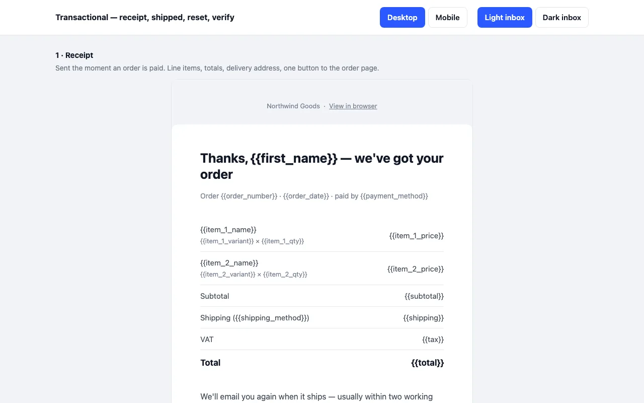
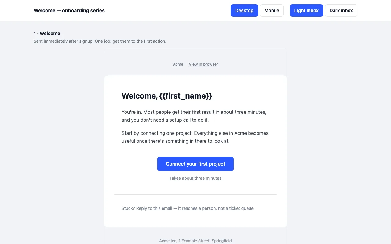
Most company newsletters are one of three things, and each wants a different layout. The
digest is a letter: an intro, three stories with a “read more”, a sign-off from a person and
one button — the weekly email most teams actually send. The magazine is an issue: a dark
masthead, a full-width lead story, two stories side by side that stack on phones, an “in brief”
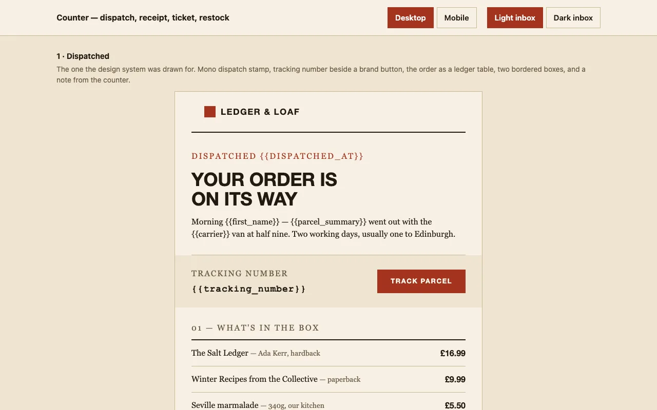
list and a promo card. The announcement is one message: a brand-coloured band with the
headline and button, two paragraphs, three facts in a row, a closing line.
All three are nested tables with conditional comments where Outlook’s Word engine needs them,
VML buttons, and a dark-mode block that Gmail and Apple Mail honour and Outlook ignores
gracefully. The two-column grid uses MJML’s column model, which is the one way to get side-by-side
that stacks without media queries Gmail strips.
Sample copy, written in full
The layouts ship with a real newsletter for a fictional bakery rather than {{lorem}}
placeholders, so you can see how much text each slot wants before you replace it. Only the links
are merge tags. Image slots carry an inline SVG placeholder with the size written on it; swap
each for a hosted image before sending — data URIs are blocked by Gmail.
What “partial” means in the table
Gmail on iOS and Android honours the dark theme by inverting colours itself rather than
reading prefers-color-scheme. The result is readable and contrasty, but it is Gmail’s
inversion, not the palette in the source. Nothing breaks; it simply is not identical.