foldout
Free + Pro Portfolio template

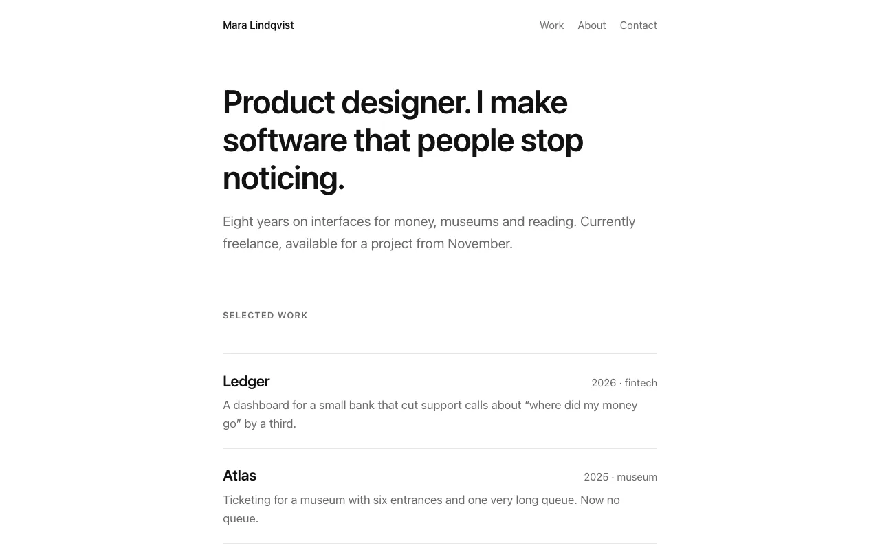
Grove — single-column portfolio template

A portfolio for a few pieces of work worth a story: work list, two case-study layouts, about, plus a contact page with an enquiry form and a 404 in Pro. Plain HTML and CSS, no build step, no JavaScript, dark mode follows the system.

  • HTML5
  • Plain CSS
  • No build step
  • No JS
  • Dark mode

Free and Pro

Pro

$9

Every page, the Pro-only pages, the source files, no attribution, and 12 months of updates and email support.

Home page, plain CSS
yes
Two case studies, about
yes
Contact form + 404 pages
yes
Partials and page assembler
yes
Scroll animations (reveal, stagger, header shadow; reduced-motion aware)
yes
Credit link in footer
not required
Updates and support
12 months, email

Free archive

  • index.html
  • assets/css/style.css
  • README.md · LICENCE.txt

Pro archive

  • index.html · about.html
  • work-ledger.html · work-atlas.html
  • contact.html · 404.html (Pro only)
  • assets/css/style.css
  • src/ · build.mjs (optional)
  • assets/js/motion.js · assets/css/motion.css
  • README.md · LICENCE.txt (Pro)

Licence

Use it in unlimited personal and commercial projects, including client work.
Do not resell the template itself, alone or in a bundle.

Full licence terms →

What this template is for

Grove is for people with a few pieces of work worth a story, not a wall of thumbnails. The home page is a list — title, year, one sentence — and each item opens into a case study built as problem → what we did → outcome, with a facts table and room for a quote.

What’s inside

Four pages of plain HTML and one stylesheet. No build step, no framework, no JavaScript: open index.html and edit. Colours, fonts and the width of the text column are variables at the top of the CSS. Dark mode follows the system setting.

The measure is the design

The text column is 42 rem — about 65 to 75 characters a line — because that is where long paragraphs stay comfortable. The type scale, the facts grid and the image slots are all sized off that one number. Change it and the page re-flows around it.

What you will need to replace

Every image is a labelled placeholder with an aspect ratio already set. Replace each with an <img> carrying width and height, and the layout will not jump while photos load. The two case studies are the same structure — copy one for each additional piece of work.
Compatibility

  • Chrome / Edge 109+
  • Safari 15.4+
  • Firefox 115+
  • iOS 15+
  • Android 10+

Read before you build

Version history

  • 1.1.0 2026-09-11

    Contact page with enquiry form and 404 added to Pro; free archive is now the home page

  • 1.0.0 2026-09-11

    First release

  • 8 KB
    home page + CSS
  • 0
    external requests
  • 0
    JavaScript
  • 6
    pages in Pro

Related templates

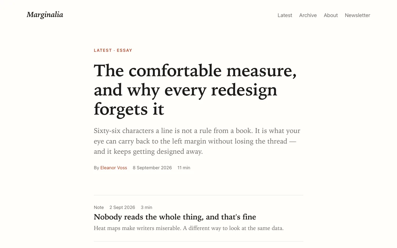
Marginalia — blog and magazine template preview

A reading-first blog in plain HTML and one stylesheet: 18 px serif at a 66-character measure, notes that sit in the margin on wide screens, article, archive and author layouts. No build step, no JavaScript, system fonts only, dark mode redrawn not inverted. Newsletter page and 404 in Pro.

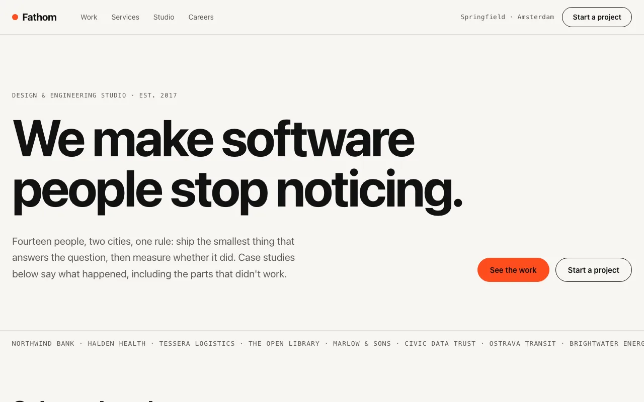
Fathom — agency website template preview

A design-and-engineering studio site that leads with the case study: results as big numbers, a 'what didn't work' section, sticky team and stack. Big type, one accent colour, no logo soup. Work, services with prices, team, contact, plus careers and a 404 in Pro.

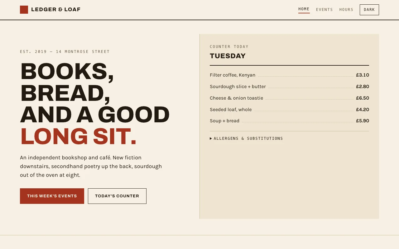
Ledger & Loaf — bookshop and café website template preview

A shop site with a counter price list, a week of dated events and opening hours, in a 1970s ledger-book style: warm paper, oxblood ink, dotted-leader rows, squared corners. Plain HTML and one stylesheet, no images, no build step.

Tell us what happened

Goes straight to a person. No account, no ticket number.

What is this about?

We keep the message and the page it came from. Nothing else — not your IP, not your browser. Privacy.